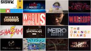
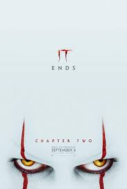
Planning blog: Title design in details
The font we will be using for the title design is Ibm plex mono. It will look something like this.
Contrast Color- The color of the titles will be white with a light-dark shadow behind them. This will make the tiles easy to see and read, as well as, add some type of intensity and mystery to the film. The font size of the main title will be 36 in size. The font size of the subtitles will be 6 sizes smaller. Letting the audience know the order of importance in the title sequence.
Working Title will be something like “The of Case 89”. It will be in bold and in all caps, LOOKING SOMETHING LIKE THIS.
The title will first enter by sliding in and zooming in a bit, then leave with a fade-out
Titles will disappear after 2 or 3 seconds except for the main title which would be 5 seconds


Comments
Post a Comment